How to analyse and trade trends using MACD?
Have you ever struggled trying to identify the right entry and exit points during a market trend? Catching the trend at the right time can make all the difference but doing so may not seem too easy. Well, to help you out with this, here's an another interesting post. Here, we’ll explore a popular tool among traders to help spot potential buy and sell signals. Let’s get started!
All the concepts covered in this email are taken from the Quantra course Technical Indicators Strategies in Python. You can preview the concepts taught in this post by clicking on the free preview button and going to Section 13 and Unit 12 of the course.
Note: The links in this tutorial will be accessible only after logging into quantra.quantinsti.com


Note that backtesting results do not guarantee future performance. The presented strategy results are intended solely for educational purposes and should not be interpreted as investment advice.
In this post, we will cover the following topics:
- Why catch trends early?
- What is MACD?
- How is MACD calculated?
- What is the MACD line and Signal line?
- What is the MACD histogram?
- MACD-based trading strategy
If you are new to Python, Python for Trading: Basic course would be helpful.
Why catch trends early?
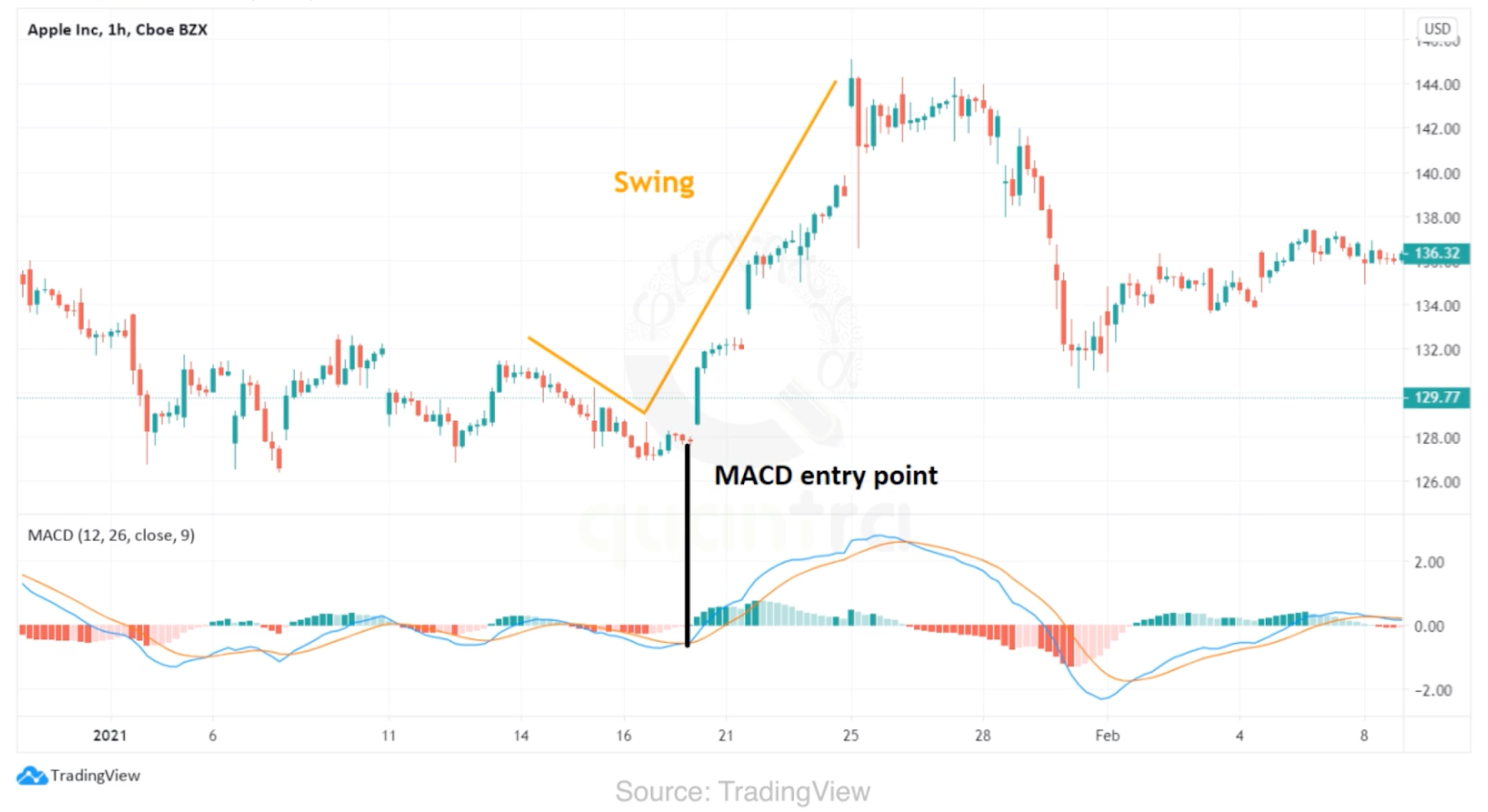
Catching a trend during its initial phase is crucial for maximizing profits and minimizing risks in trading, as it allows you to capitalise on the majority of a trend's movement before it becomes widely recognised. To achieve this, traders often rely on technical indicators, with one of the most effective being the Moving Average Convergence Divergence (MACD).
What is MACD?
MACD stands for Moving Average Convergence Divergence. It was created by Gerald Appel in the late 1970s.
In the above price graph, you can see that there are blue and orange lines. The MACD gives a buy signal when the blue line crosses the orange line from below. This crossover indicates the beginning of a bullish trend. Along with the blue and the orange line, you can see a lot of things in the graph. Like the green and red bars of varying shades. You must be wondering: what are the lines and bars? Let us see the components and detailed working of MACD.
How is MACD calculated?
Moving Average Convergence Divergence is based on the principle of moving average crossovers. Crossovers are widely used to signal a change in the trend.
To compute the divergence between the moving averages, we first need to calculate the short-term and long-term moving averages. You can either calculate a simple moving average or an exponential moving average.
For illustration, we will calculate the exponential moving average. We will keep the span of the short-term moving average equal to 12. Then, we will calculate the long-term moving average. We will keep the span of the long-term moving average equal to 26.
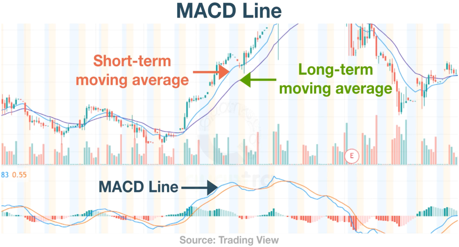
The two moving averages tell us about the movement in the price series. The 12-period EMA tells us about the price movements in the short term. And the 26-period EMA tells us about the price movements in the long term. The 12-period EMA would be more sensitive to the recent price changes, and the 26-period EMA would be less sensitive. In an up-trending market, the 12-period EMA will move up faster than the 26-period EMA. And in a down-trending market, the 12-period EMA will fall faster than the 26-period EMA.
After calculating the two moving averages, we will calculate the difference between them. As the difference increases, it indicates that the two moving averages are moving away from each other or are diverging. And the trend is growing stronger. A positive divergence indicates an up trend, and a negative divergence indicates a downtrend.
What is the MACD line and signal line?
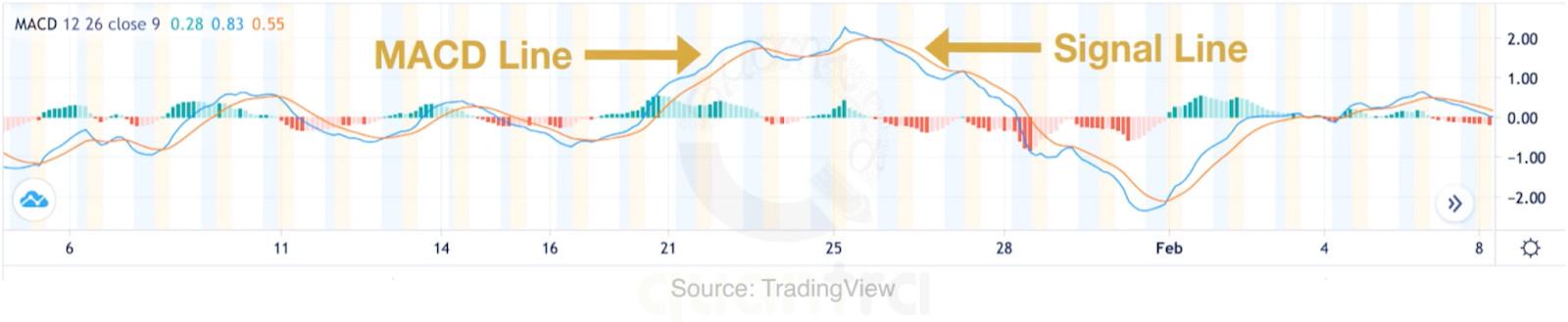
The difference between the short-term and long-term moving average is called the MACD line. This line is the first component of the MACD indicator and is shown using the blue line in the below graph.
If the MACD line is rising, then it indicates a positive trend. To determine if the MACD line is rising, we will compare the MACD line value with its own moving average. The moving average of the MACD line is called the signal line. It is shown using the orange line and is typically computed using a 9-period moving average.
As a general rule, you can buy the security when the MACD line crosses above the signal line. Similarly, you can sell the security when the MACD line crosses below the signal line.
You must have also noticed the bars along with the two lines. This is the third component of the MACD indicator. It is called the MACD histogram.
What is the MACD histogram?
You can see the green and the red bars of varying height along with the MACD and the signal line. The height of the bar represents the difference between the two lines. The longer the bar, the farther the lines.
If the MACD line is above the signal line, the difference is positive. In this case, the bar is above the baseline or zero line and it is green in colour. Otherwise, it is below the baseline and is red. But what are the varying shades of the bars? If you take a closer look at the bars, you will see that if the bar is longer than the previous bar, it has a darker shade. Otherwise, it is light. Therefore simply by looking at the height and the colour of the histogram, you can say whether the two lines are moving towards each other or away from each other.
If the lines are moving towards each other, they are said to be converging. And if they are moving away from each other, they are said to be diverging. Hence, we have the name Moving Average Convergence Divergence. If the shade of the bar is dark the trend is growing stronger. And if it is light, the trend is getting weaker.
MACD-based trading strategy
Until now, you have learned about all the components of the MACD indicator. Let’s now create a trading strategy based on MACD. The strategy can be as follows:
Entry Rule:
Buy if: MACD line > Signal line
Exit Rule:
You can exit this trade when the MACD line crosses the signal line from above
It is important to backtest this strategy so that we can know the effectiveness of this trading strategy.
The strategy discussed above has been covered in detail along with the Python code in this unit of the Technical Indicators Strategies in Python course. You need to take a Free Preview of the course by clicking on the green-coloured Free Preview button on the right corner of the screen next to the FAQs tab and go to Section 13 and Unit 12 of the course.

What to do next?